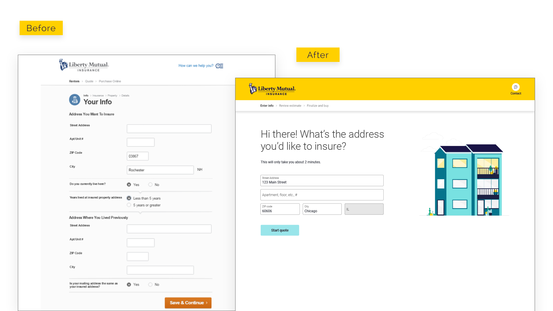
Transparency and time to quote did not meet expectations
Transforming an out-dated experience to suit the modern customer.
Customers were not converting as expected in our Renter insurance flow. This occurred even after an annual rate adjustment to insurance rates and premiums.
Our team kicked off this project with a multi-day design workshop, with our team and stakeholders. We were determined to uncover the pain points and friction that our customer’s were experiencing. User research helped answer these questions as well as in-person usability tests to validate new concepts.
Discovery Stage
Design Workshop
Define Stage
Site-wide Rebrand
Design Stage
Design System Components
Deliver Stage
QA & Testing
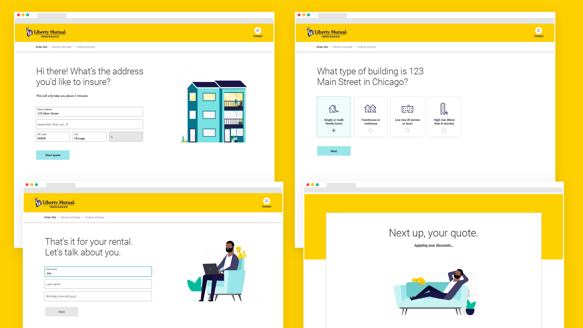
Final designs
Massive business impacts with new experience
We made big strides by removing 13 questions from the quote as well as reducing fallout rate and elevating overall throughput to checkout.
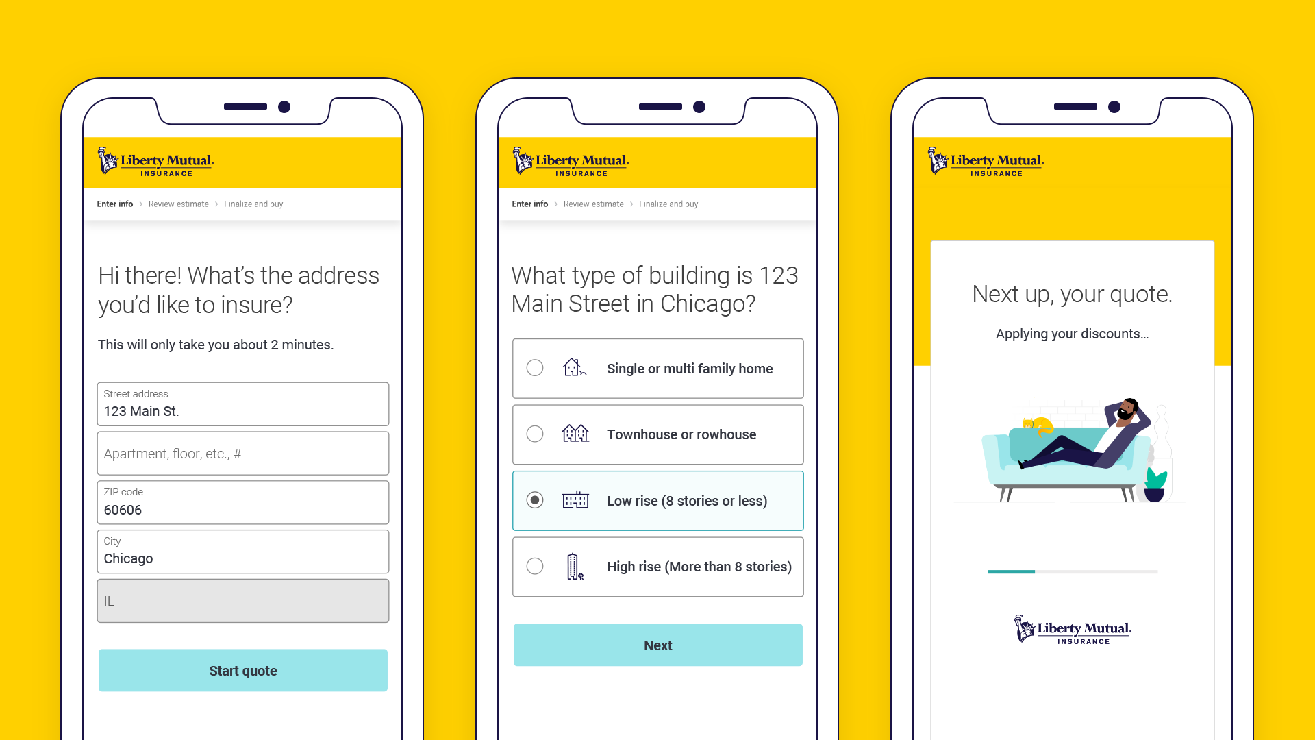
One question at a time flow
By asking one question(s) at a time, we greatly reduce the customers mental fatigue and prevent excessive mobile scrolling.
Supporting iconography
Customers often tripped up on the building materials question, often not knowing what their apartment building is made of.
Guiding help text
We are now providing extra guidance to customers with exposed help text that explain questions and coverages.
Mobile best practices
We are using large tappable fields and buttons which decrease selection errors on mobile, and some use complementary icons.